tiny spaces
The CONCEPT
The concept centers on utilizing high-quality materials, engaging storytelling, and a clean, minimalist design that draws attention to the vehicle. The space is carefully crafted to highlight key elements such as color, texture, and technology, creating an immersive experience for users despite its compact size. The goal is to prove that a well-designed small space can captivate and engage just as effectively as a larger display. This is achieved by focusing on precision in design, clever use of space, and ensuring that every detail aligns with the brand’s identity. The experience should feel thoughtful, fun, and inviting, encouraging users to explore the vehicle and its features in a way that is both informative and enjoyable. Ultimately, this project seeks to challenge traditional notions of scale in marketing displays, demonstrating that impactful brand experiences don’t require vast spaces but can be equally powerful when condensed into smaller, meticulously designed environments.
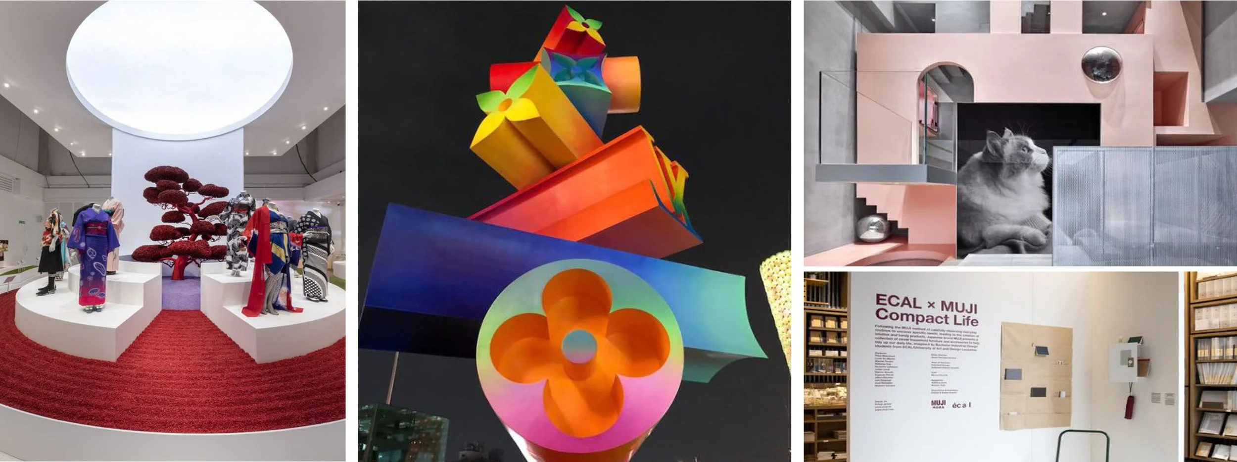
INSPIRATION : BOLD, THOUGHTFUL, IMMERSIVE
The project, inspired by the idea of being thoughtful in every detail—colors, materials, and placement—aims to create an immersive space that goes beyond just showcasing the vehicle. The focus is on making the entire space an experience, where every element is carefully considered to evoke a strong connection with the brand and the product. The goal is to ensure that the space, though small, feels complete and engaging, drawing users into a memorable and impactful brand experience.
EXPLORATION OF SPACE
The project aims to create two phases of small, fully branded experiential spaces that highlight key aspects of a vehicle, such as color, materials, and tech specs. Both spaces are designed to focus on intricate details and high-quality materials, creating immersive and impactful user experiences without relying on graphics. The two phases differ in size but maintain the same design ethos.
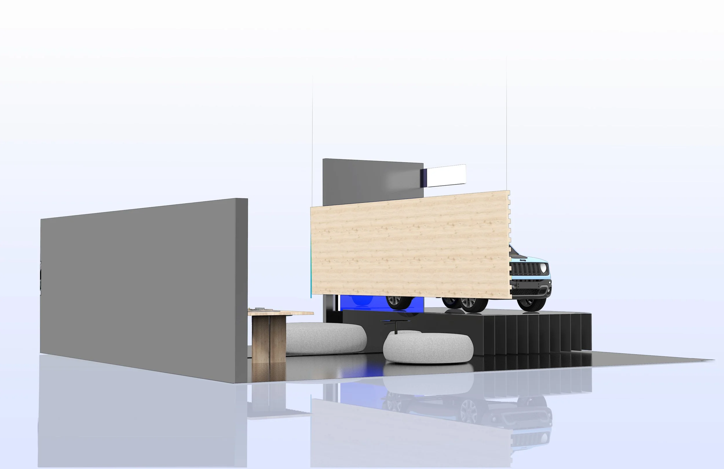
JEEP SPACE 01
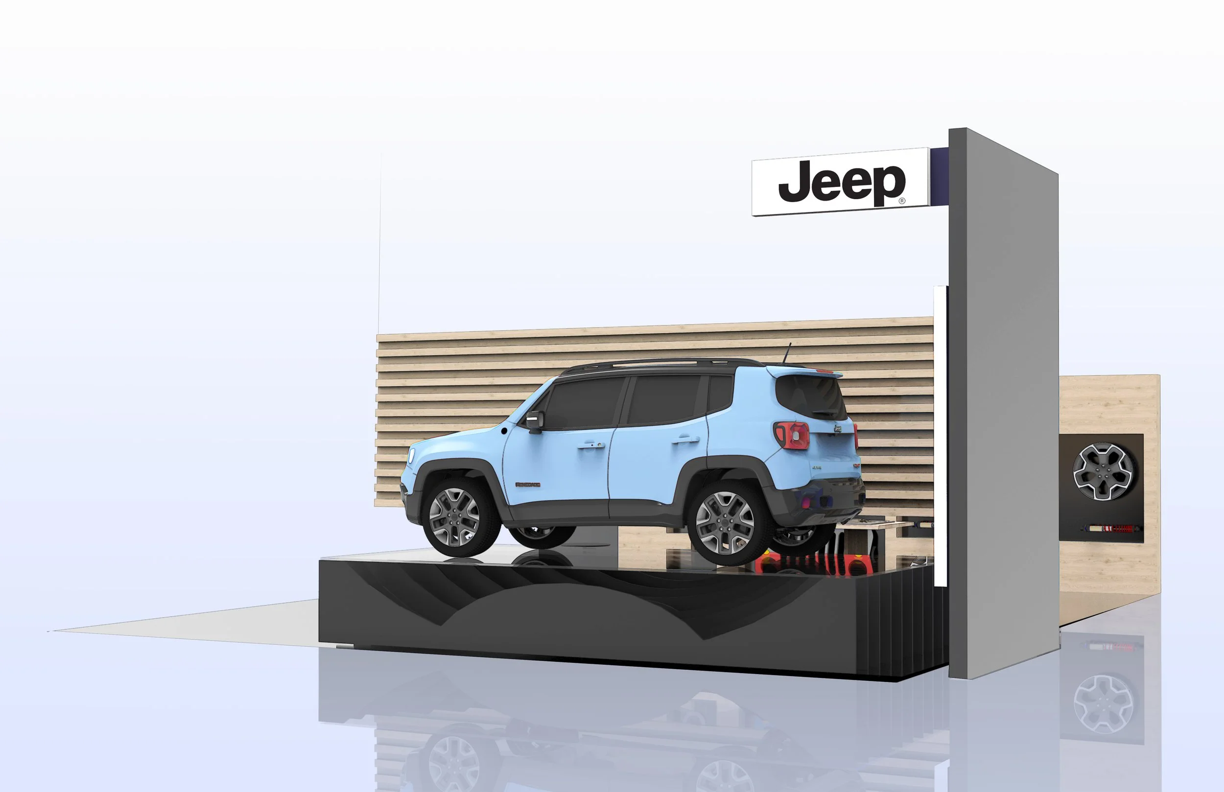
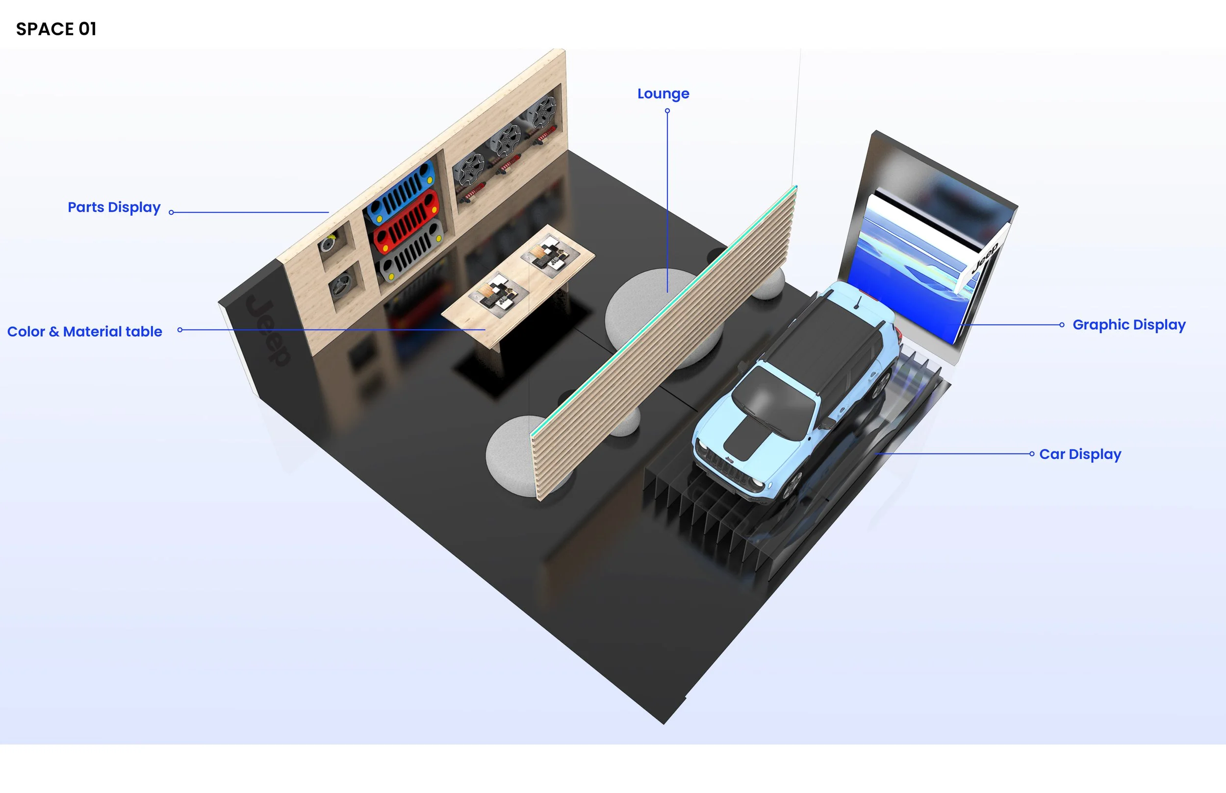
The first space in the project is designed to immerse users in the Jeep brand through storytelling that emphasizes color, materials, and sports performance. The layout is divided into two main sections: one for displaying the vehicle and another at the back for presenting more detailed information. The back wall becomes a focal point, showcasing the brand’s performance aspects in a visually impactful way. Every inch of the space is utilized with intention, ensuring that the materials and placement of elements are thoughtfully curated to reflect Jeep’s identity and engage the user fully.
color & material board
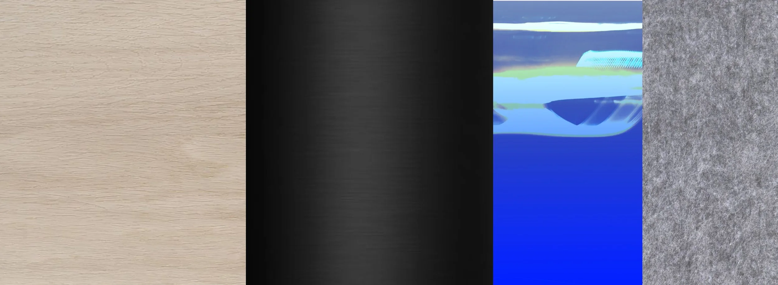
The Jeep space utilizes a thoughtful combination of colors and materials to reflect the brand’s identity and create an inviting, immersive environment. Here’s how each element contributes to this: Warm Wood: This material is chosen to represent the outdoorsy and adventurous side of the Jeep brand. Warm wood tones evoke a sense of nature and ruggedness, aligning with Jeep’s image as a vehicle for outdoor exploration. Additionally, wood adds warmth to the space, making it feel more welcoming and comfortable. Sleek Black: The use of sleek black elements introduces a modern, sophisticated contrast to the warm wood tones. This contrast helps balance the space, preventing it from feeling too rustic or old-fashioned. Black also adds a touch of elegance and reinforces the premium aspect of the Jeep brand. Graphic with a Pop of Color: Introducing a graphic element with vibrant colors adds energy and visual interest to the space. This pop of color can draw attention and create focal points, making the environment more dynamic and engaging. It also prevents the space from feeling monotonous and helps in highlighting key areas or features. The goal of combining these materials and colors is to reflect the Jeep brand’s rugged yet refined character. By using warm wood, sleek black, and colorful graphics, the space becomes immersive and visually appealing without being overwhelming. This thoughtful design approach ensures that the environment enhances the user experience, aligning with Jeep’s brand values and creating a memorable impression.
SPACE 01
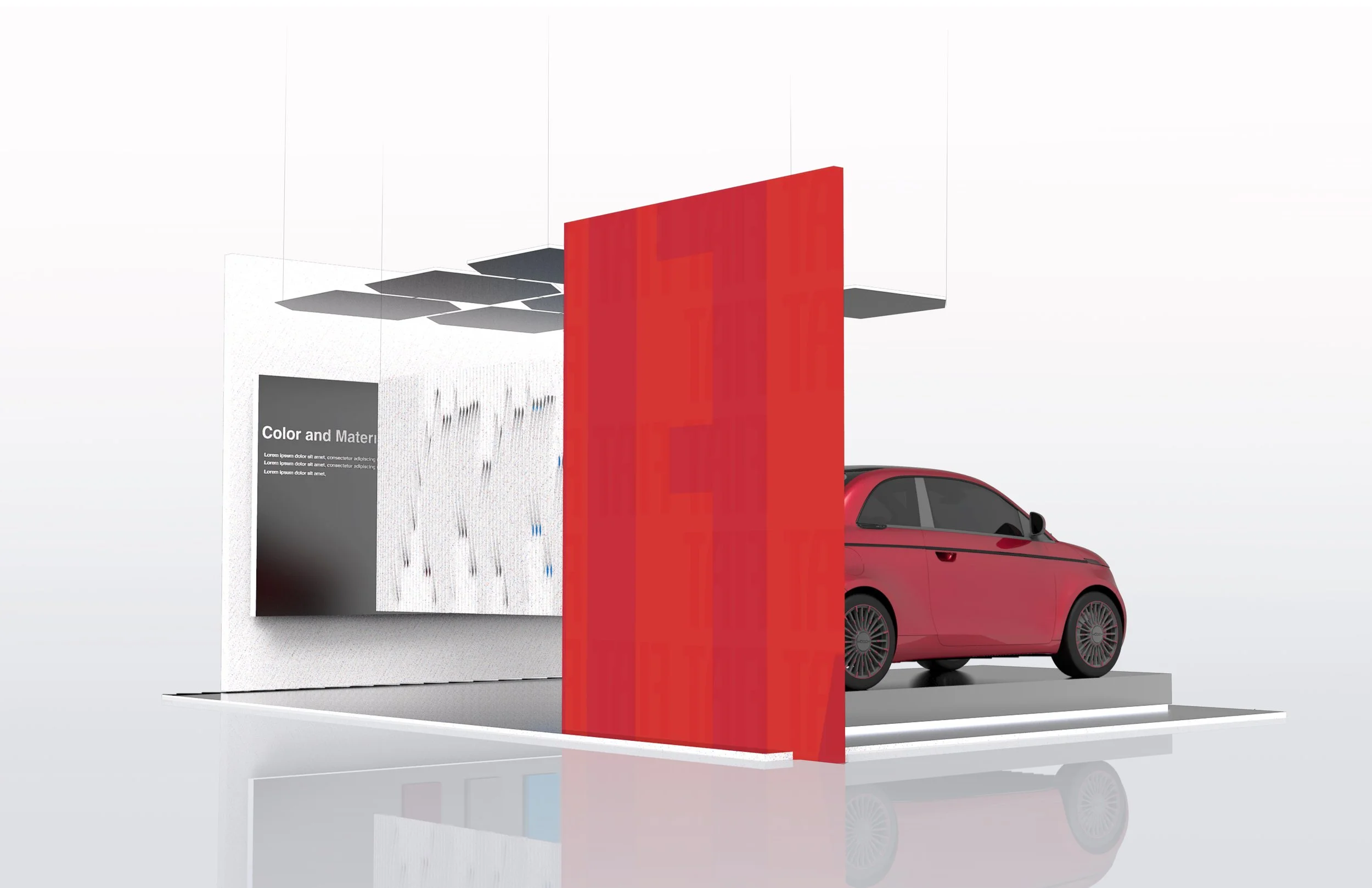
FIAT SPACE 01
In space one, the design is meticulously divided into two sections to maximize impact. The first section prominently displays the vehicle against a striking backdrop that serves as a canvas, framing the vehicle in a visually compelling way. The second section delves into the storytelling aspect, highlighting the interior features, color materials, and design details of the vehicle. Special attention is given to performance information, with thoughtful placements of materials and seating to create a cohesive, immersive experience. The entire space is designed with minimalism in mind, ensuring that every square foot is utilized to its fullest potential, offering a seamless exploration for users.
color & material board
The design strategy for the Fiat space employs a vibrant combination of colors and materials to reflect the brand’s playful and stylish identity, creating an engaging and immersive environment. Here’s how each element contributes to this. Fun Colored Terrazzo: The use of colorful terrazzo embodies Fiat’s lively and spirited brand character. Terrazzo, with its speckled, playful patterns and bright colors, brings a sense of fun and creativity to the space. This choice of material makes the environment feel youthful and energetic, resonating with Fiat’s image as a stylish and approachable brand. Sleek Black: Incorporating sleek black elements provides a modern and sophisticated contrast to the playful terrazzo. This contrast helps to balance the space, adding depth and preventing it from becoming too whimsical. Black elements lend a sense of refinement and elegance, highlighting the quality and contemporary aspect of Fiat. Graphic with a Pop of Color: Adding a graphic element with vibrant colors further enhances the playful atmosphere of the space. These colorful graphics can create focal points and draw attention to specific areas, making the environment more dynamic and visually stimulating. They also ensure the space remains engaging and visually interesting. The goal of combining these materials and colors is to reflect Fiat’s fun and fashionable character. By using colorful terrazzo, sleek black, and vibrant graphics, the space becomes immersive and visually appealing without being overwhelming. This design approach ensures that the environment
SPACE 01
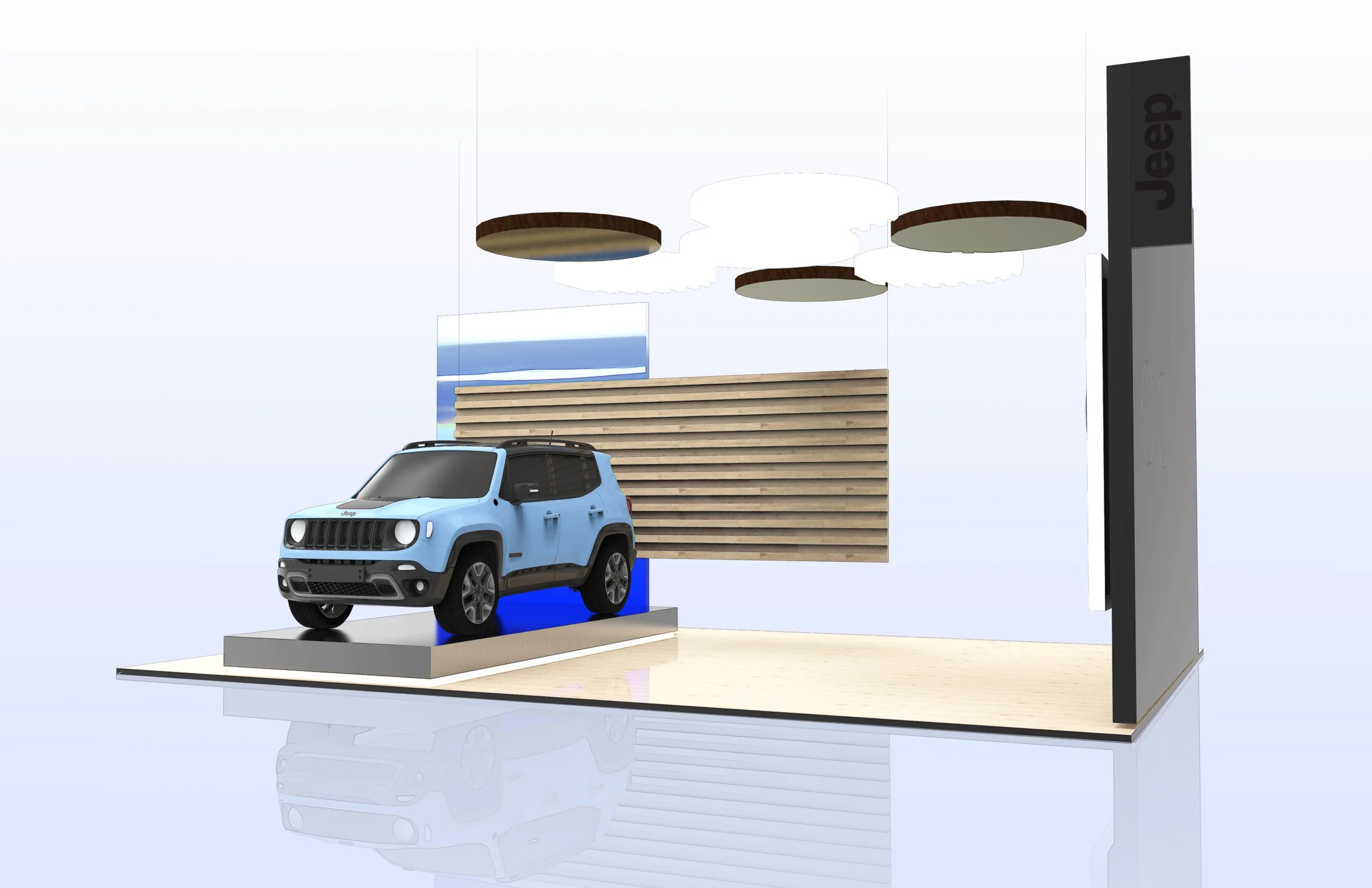
JEEP SPACE 02
Jeep space two, while on a much smaller scale, carries forward the same principles as space one. The focus is on carefully considering colors, materials, and placements, even within the constraints of a single wall. This wall showcases technology, color materials, and the vehicle itself, ensuring that the brand’s ethos is effectively communicated. The design emphasizes a fun and playful approach, making the space engaging and memorable while maintaining Jeep’s identity through thoughtful use of elements.
SPACE 02
FIAT SPACE 02
Fiat space two retains the same principles as space one but adapts them to a smaller scale. By incorporating key elements from space one, the focus remains on communicating color, material, design performance, and technology within a compact area. Despite its size, the space aims to maintain the brand ethos and deliver a user experience that feels immersive and thoughtfully designed.

